This website stores cookies on your computer. These cookies are used to collect information about how you interact with our website and allow us to remember you. We use this information in order to improve and customize your browsing experience and for analytics and metrics about our visitors both on this website and other media.

- Design
Top 25 SaaS Company Websites for Inspiring Developers & Designers
Software as a Service (SaaS) has revolutionized the way businesses operate, offering innovative solutions that can be accessed and utilized directly through the web. As the demand for cloud-based software solutions continues to grow, several top SaaS companies have emerged, each with its unique value proposition and a strong online presence through their websites.
These SaaS company websites serve as powerful platforms for showcasing their products, engaging with customers, and driving business growth. They often incorporate sleek designs, intuitive user interfaces, and compelling content to create an exceptional user experience. In this post 39 Ft. Creative describes the website design style for each SaaS company that have become industry leaders.
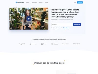
Help Scout logical approach use a video testimonial at the top of the page is text book web dev move – it’s works! on the right side they follow up with a powerful CTA “Start My Trial” button to get your email, again a smart play for lead generation. It’s a strong approach to speak to your customers and give them something for nothing – free trial is irresistible. It’s most effective for new customer experiences to try before they buy.
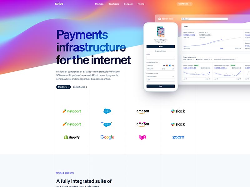
Stripe’s color choices play a big factor in their business methodology. The purple and orange gradient tones with a diagonal banner is a bold structure that says “we’re trendsetters”.
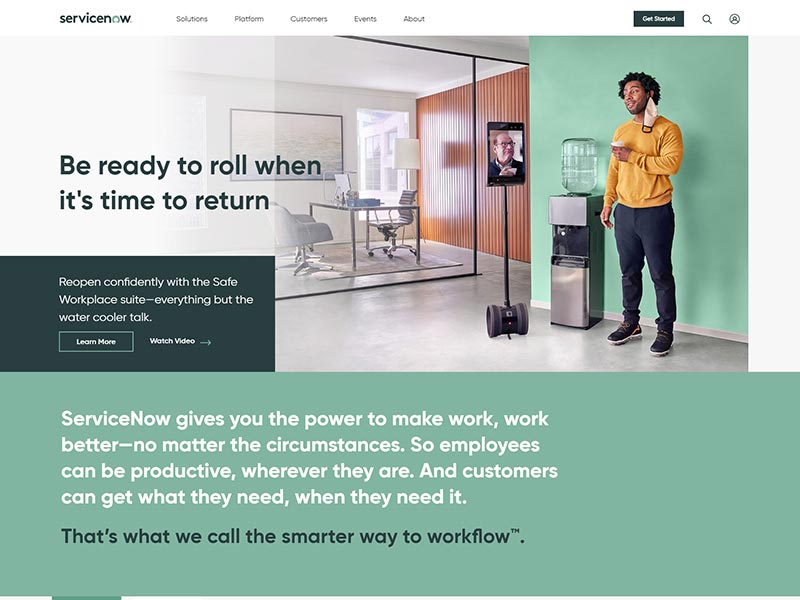
One of our favorite SaaS in the industry, yes, really look at what they created. They’re… the leading enterprise service management company in the world. With tons of information to have a website they figured out the mega menu system and elegantly designed a system meant for their customers to navigate. Fonts are larger too, and utilize their communication to be easily read.
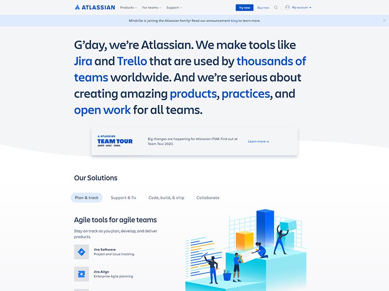
Vibrant blue, is the huge trending color for tech companies. Another drawing trend is illustration clipart or graphics in action as I like to say it. Infographics are worth a thousand words if done correctly and support the data, but for this example . Software solutions are incredibly difficult to explain to people in general, so make it less daunting and breakup the space to let your content form it’s own layout. What a better way to show their customers using the software and solving their business challenges. Did we mention we love using their Jira project management tool.
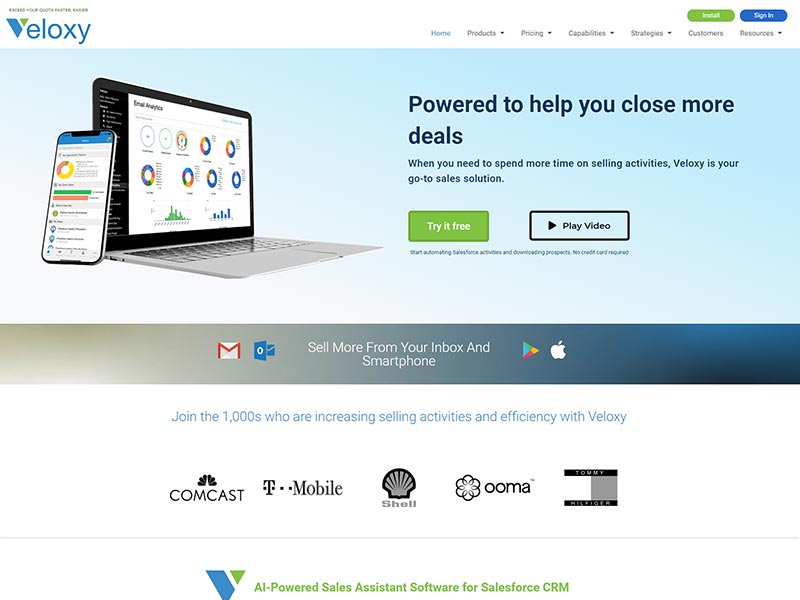
Ai Solutions are huge for businesses using Salesforce to manage their sales teams – everyone can use it. See how the green and blue colors together creates a sense of loyalty around the brand. They have amazing ratings on G2Crowd – another amazing for reviewing SaaS Ai, checking out if you don’t know about them. The brand and typography balances calm colors great for reading, and showing off a little of their client accolades.
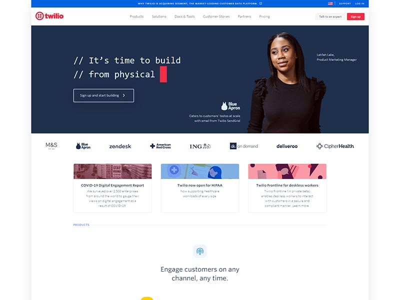
Pastel colors and motion are big players for this website. Plenty of spacing and lots of leading for content prevents users from getting overwhelmed. Short and sweet menu structure makes this a clean website without too much fluff.
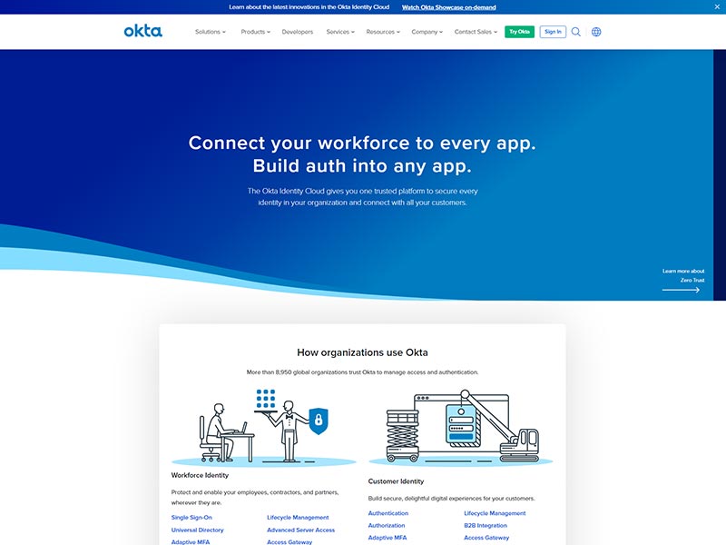
The Okta cloud platform uses blue gradients and a curved banner to draw you in – “just slide into our software”. The top navigation menu uses space, and the commonly used demo, and sign in buttons to attract customers to make a decision quickly.
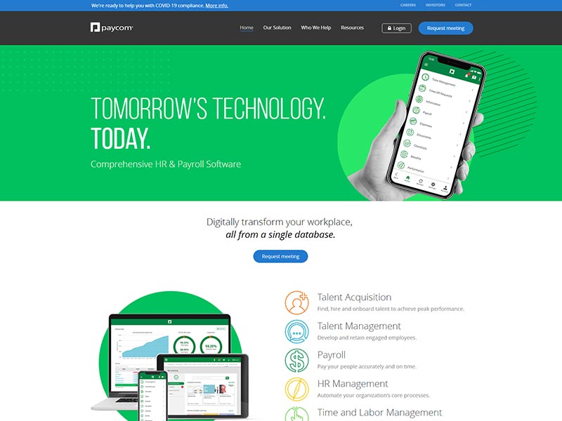
Modern design with elemental shapes helps to tell Paycom’s story. Their main navigation highlighted in navy blue directs your eye to the important links. Also, space division is a great choice for creating hierarchy within the menu.
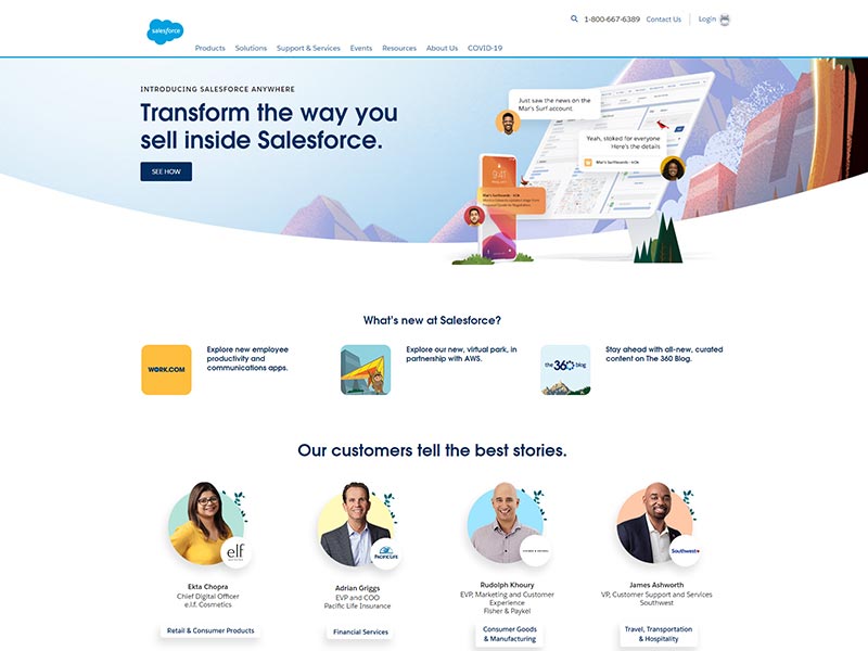
By far, Salesforce has created a brand character, something few enterprise companies have even scratched the surface. More interestingly the kid-like character with a bear costume is their main character, with also a white hair Einstein, an owl, and other characters help tell their story and make it entertaining. They have created two brands in one and were able to have a cloud for logo to show their tech side, and funny nature characters to have a fun side, instead of the average 1 sided brand.
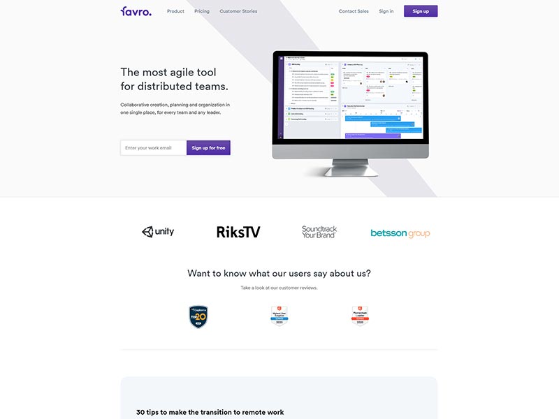
Lots of white, with lots of space. This is a good design if you don’t have a lot of content, but want to be smart with call to actions. The “Sign up for free” button is their most important lead generator element. Straight to the point pricing page too, helps with explaining the cost structure – they did this well.
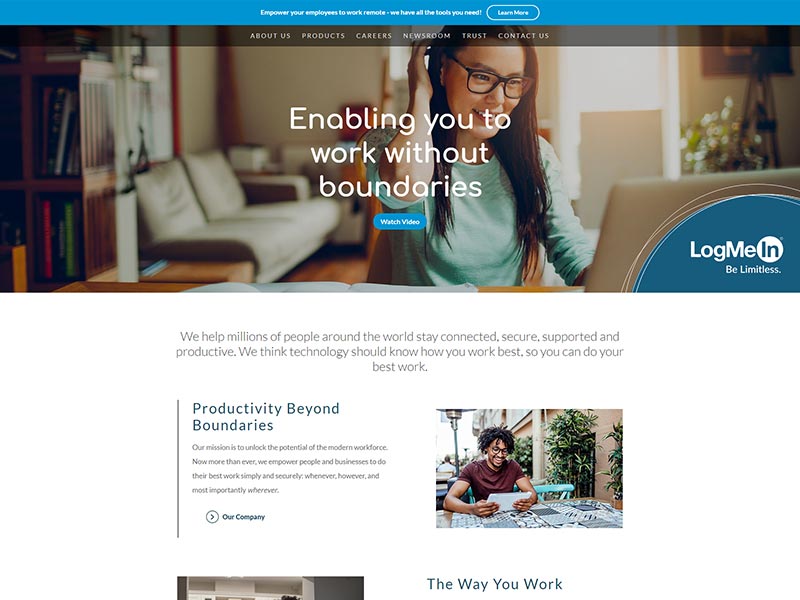
Large happy faces, and great headline, goes far in today’s communication. They give you a clear value proposition in a minimalistic look.

Blue, white and light grey work so well together for a web color scheme. See how they separate their service silos with bright colors. The solutions page is our favorite, we enjoy the color overlay and image effect to get a space for copy to be read easily over top of an image.
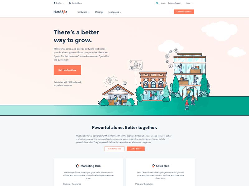
Bright orange for Hubspot’s brand color is very prominent across the website – for good reason. It’s emotional connection makes us think high-end and dependable. The main menu combines icons, hierarchy, and 3 main links for their menu structure, not including the demo button. They give us a pleasant menu that’s easy to flow through and to learn more about their marketing services.
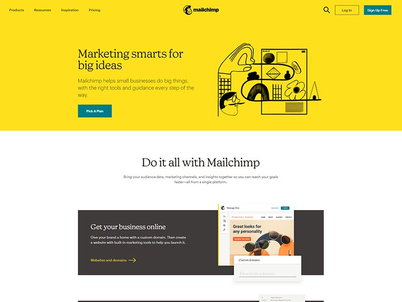
Serif fonts are a trendy and yet effective typeface for headlines and readability. It gives an articulate way to communicate your message to your customer in a different tone than traditional agency talk.
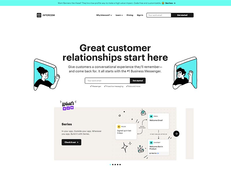
Animations are huge trend in web design if you want to get noticed – everyone loves movie directing. Animated icons help tell a story better than writing big paragraphs, still good copy is great for SEO, we will talk more about in future posts. If your dream is to create your own animated video or icons, keep it simple, there’s plenty of websites our there that have content libraries of animations so do some exploring. Think about how much longer you stay on a web page and stare at this little animating graphic – that’s the really value for your website.
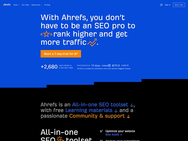
Blue and orange making another appearance, and boy do they have great contrast. They use a full-width menu and dark colors create this unique experience. Bold links are highly clickable call to actions, improving your click-through rate. Maybe that’s why they’re pros at SEO.
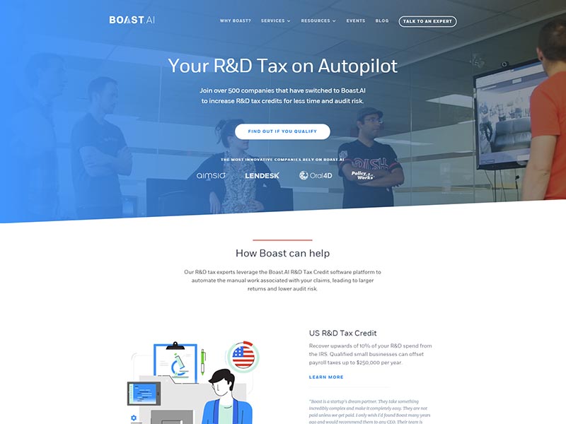
Video backgrounds are another major web design trend, but still few company websites take advantage of the benefits. Clip art infographics make another appearance and feel more connected to the brand.
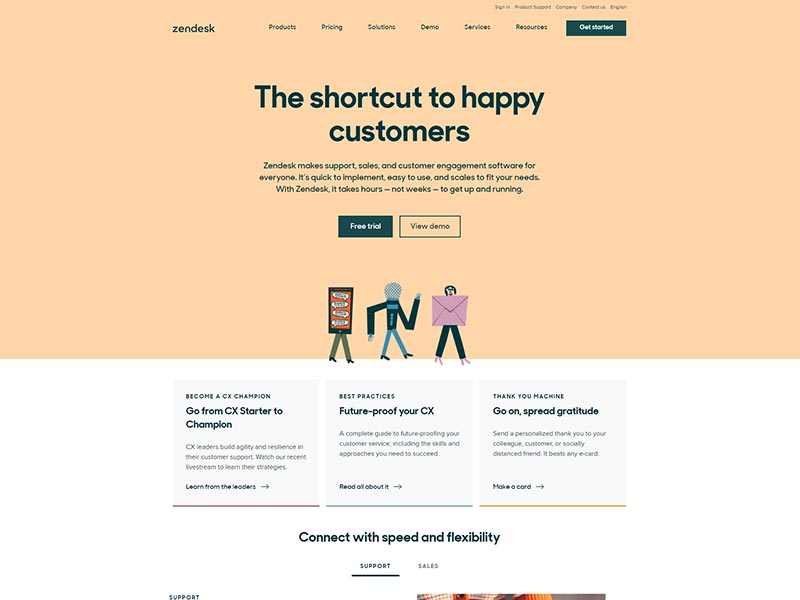
Big headlines, a full screen banner, and overlapping content helps to break the mold of common design layouts.
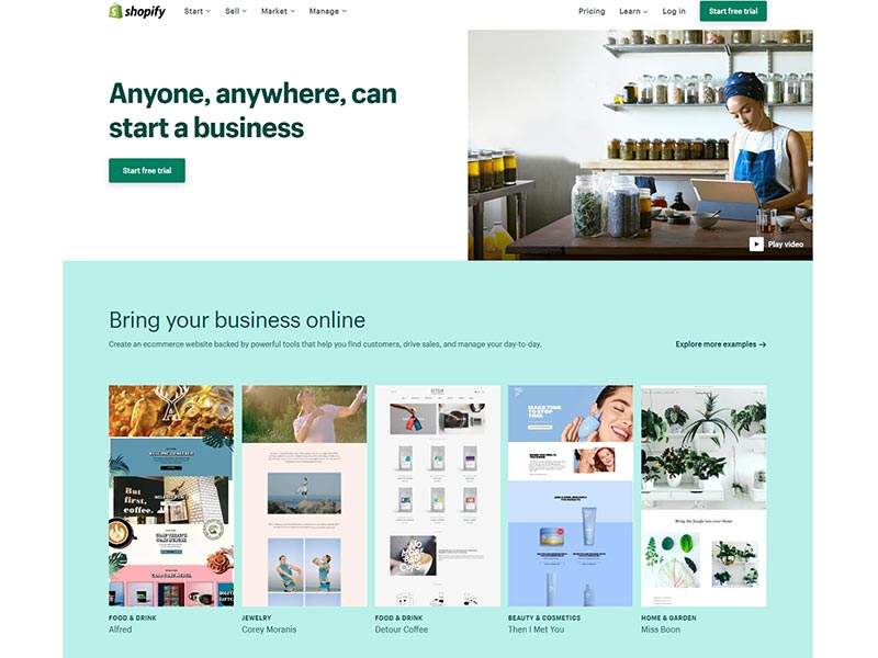
The 2 sided top banner directs your eyes to the “Start free trial” button. I picked this site because I think they’re ready for a redesign because they have stayed with this design for a few years if memory serves me right. But this is a good thing, redesigning a website gives you a fresh start, and a chance to pivot from an old brand.
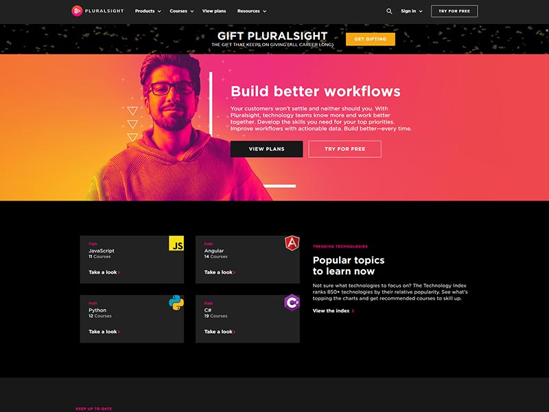
Remember dark is in and bright neon glowing colors. This is a great look for online course websites that are attracting younger audiences.
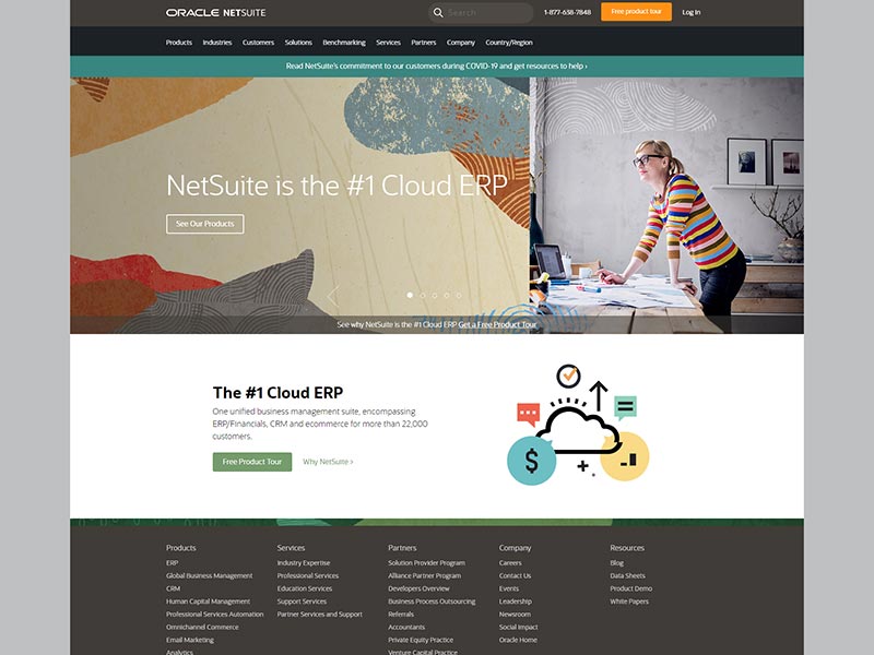
Sliding banners aren’t a favorite by some. There’s too much information sliding past your eyes, and usually don’t convert well. One idea is to make the slider one continuous message that tells a story to the user, and easily guides them along a path, not trying to tell multiple stories at once.
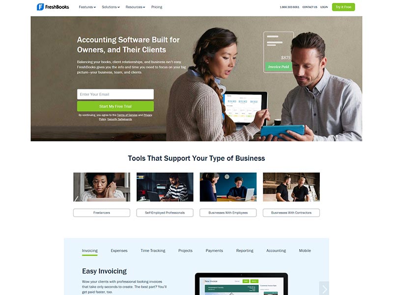
Customer-facing website layout with people like you and I help connect the brand to the customer, especially if you target the persona. We give FreshBooks two-thumbs up for their software and design customization for the user to have more options. Yes, we use their service because they paid attention to design – it’s the main topic for this article.
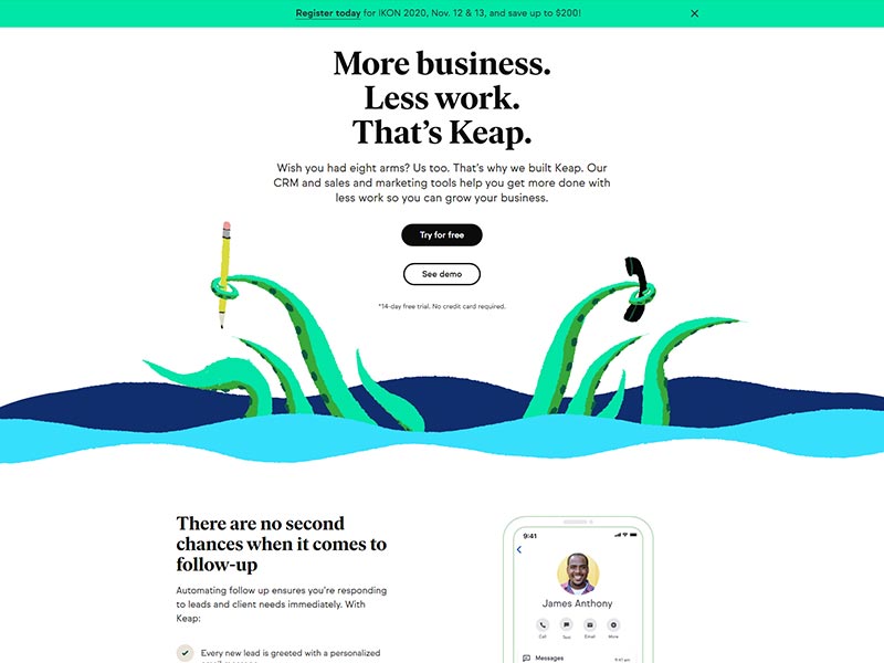
Bold serifs, with an immediate full-screen pop. Not sure we would have done that, but they are offering a huge promotion. They do a great job of showing how the software works and cuts right through the clutter. Showing customers how it works without overdoing CTA’s or sales talk makes their website stand apart.
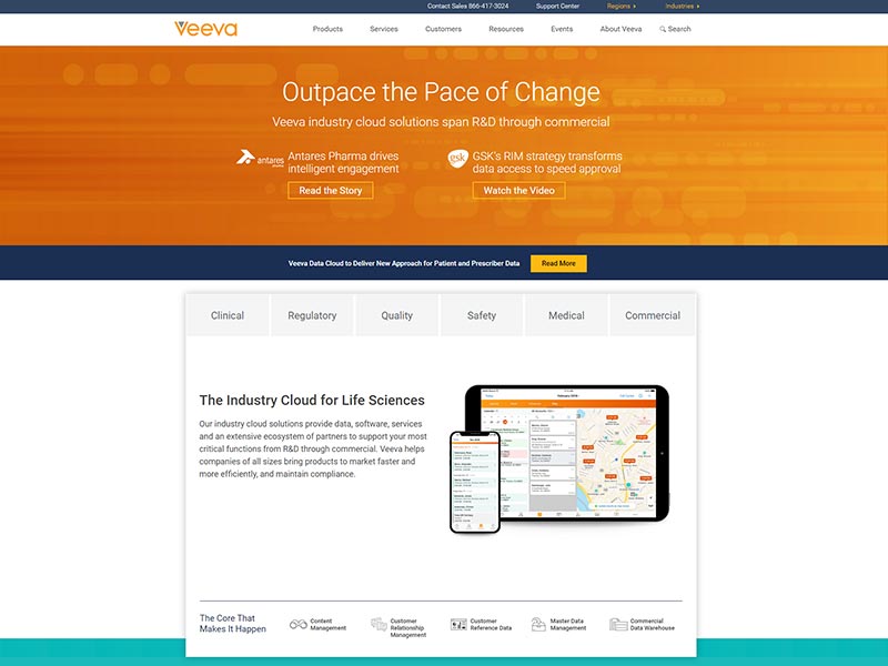
Orange is becoming a color trend for some agencies who like to stand out. We recommend not to be afraid of trying out new colors, but keep in mind hierarchy and contrast, too many colors can become busy quickly.
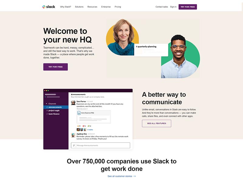
Colors to leverage your personas’ identity is the best design strategy to win over customers. Why? It gives the emotional comfort to the customer to let them know you’re on their side, and you understand their needs. They use heavy shadows on flat graphics to give that 3D effect and it pops off the page.
